


Previewing the new uniforms
 By Roch Kubatko
I stopped by the warehouse today to check out the Orioles' new caps and jerseys. I think most of you will be pleased with the changes.
The club requested that no further details be published until 9:30 a.m. tomorrow, so I'm following the embargo.
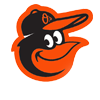
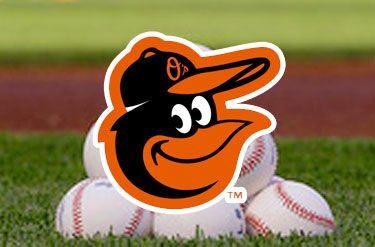
You already know that the Orioles have gone back to the cartoon bird on the caps - taking elements from the 1970 and 1983 models - and that the angle of the Baltimore script on the road jerseys no longer tapers at the end.
I can tell you that the cartoon bird more closely resembles the '70 version in overall shape. At first glance, you might not notice the difference.
Upon closer inspection, you'll find that the bird is wearing an O's cap. The previous model looked like a black smear. And there's a white mark along the edge of it, just like the '70s version.
Also, the bill of the bird's cap is straighter - perhaps a tribute to George Sherrill.
Probably not.
I'll have much more to say about the caps and jerseys in the morning, and we'll post photos of them.

LATEST ORIOLES NEWS
LATEST NATIONALS NEWS
About the author
By accepting you will be accessing a service provided by a third-party external to https://www.masnsports.com/